

When it comes to adding a touch of whimsy and vibrancy to your space, look no further than the mesmerizing rainbow ombre effect. Originally popularized in the world of paint, this technique has now found its way into various rooms, including the enchanting realm of children's spaces. In this blog post, we will explore the versatility of the rainbow ombre effect and how it can transform a child's room into a magical haven. But that's not all - we'll also discuss creative ideas for incorporating this captivating technique into other areas of your home. We’ve used it to make the bookshelves really pop our white items
Sparking Joy and Creativity in a Child's Room:
The rainbow ombre effect is a perfect match for a child's room, as it effortlessly brings a burst of vibrant colors and playful energy. From nursery to playrooms, this technique can create a cheerful and imaginative atmosphere, stimulating creativity and fostering a sense of joy. We'll dive into the step-by-step process of achieving the rainbow ombre effect, including color choices, blending techniques, and tips for a flawless finish.
Infusing Magic into Other Spaces:
While the rainbow ombre effect is undoubtedly a showstopper in a child's room, its versatility extends far beyond. This captivating technique can be adapted to different areas of your home, such as a feature wall in a family room, an accent wall in a home office, or even a surprising twist in a bathroom. The rainbow ombre effect can inject a pop of color and personality into any space.
Themes and Personalization:
One of the most exciting aspects of the rainbow ombre effect is its ability to adapt to different themes and preferences. You can customize the colors and gradients to match existing decor or create a theme-inspired room. Whether it's a unicorn-inspired bedroom, a superhero-themed playroom, or a nature-inspired nursery, the rainbow ombre effect can be tailored to perfectly complement your desired aesthetic by using 2-3 three colors. We've added a few examples and color choices.
The rainbow ombre effect is a captivating technique that goes beyond traditional paint applications, offering a delightful and whimsical touch to any space. From child's rooms to various other areas of your home, this mesmerizing effect brings a burst of color, joy, and creativity. So, whether you're looking to create a magical haven for your little ones or infuse an exciting twist into your living spaces, the rainbow ombre effect is the perfect choice to make your home truly enchanting.
"The rainbow ombre effect effortlessly brings a burst of vibrant colors and playful energy, transforming a child's room into a magical haven."
Creating a striking rainbow ombre effect with Annie Sloan Chalk Paints® is a step-by-step process that allows you to infuse personality and style into your furniture. Before you begin, gather the following items:
- Several Paintbrushes or sponges
- Annie Sloan Chalk Paints® in the following colors:
- Emperor's Silk (bright red)
- Capri Pink
- Barcelona Orange
- Tilton
- English Yellow
- Napoleonic Blue
- Florence
- Antibes Green
Before we start we want to stress that there are a couple of things you will need to keep in mind. First that there is no perfect method but practice makes excellent, we strongly encourage a practice run in a small piece of paper for you to decide what colors you want for your Ombré effect skim through as we provide various color combinations that work well alone! …ER together.
We also recommend you allow one side to dry before starting on another. Work your yellow side before your blue side. I promise this will make sense later!
Now, let's dive into the process:
Step 1: Start with a Small Half Circle in Red
Begin by painting a small half circle slightly to the left side of your furniture piece using Emperor's Silk paint. This will serve as the foundation for your ombre effect.

Step 2: Transition to Pink
To create a seamless transition, apply Capri Pink around the edges of the red half circle. when introducing a new color add it separately to where you want it to go then and only then proceeds to blending.

Use a paintbrush or sponge to gradually blend the colors together. This can be achieved a number of ways. By blocking out your colors where you want them you can start with gentle circles into the next color. When I feel like changing it up I make small Xs back and forth between the colors to. Damp your brush prior to the blending to help the paint run together better.
Step 3: Blend Orange and Yellow Tones
On the left side of your piece, apply Barcelona Orange and blend it into the Capri Pink. this should creat a delicious Salmon color!


Gradually blend the Barcelona Orange into Tilton, a warm yellow tone. Continue blending Tilton into English Yellow, creating a smooth gradient fromy orange to yellow.
This is a delicious warm ombré effect on its own. Think Fire, think warm sunny days, incredible sunsets!
Step 4: Blend Blue and Purple Tones.
On the right side of the Capri Pink, blend the pink into the blue, creating a smooth gradient. As the Capri Pink blends with the blue, it will create a rich beautiful magenta purple tone and then a true purple. Flesh this out until you have the napoleonic blue.

"From feature walls to accent pieces, the versatile rainbow ombre effect injects a pop of color and personality into any space, making it truly enchanting."

Step 5: Transition to Green-Blue Tones
Apply Florence, a rich turquoise shade to Napoleonic blue, and equally powerful blue . Gradually blend the Florence, creating a seamless transition from blue to turquoise . The resulting colors are very blue teal with incredible depth colors.
Using Napoleonic Blue, Aubusson and Florence or the light Provence. toned down with whites, creates a sea of deep possibilities that comes to life as shown here here on our ombré cabinet.
Step 6: Blend Turquoise to Green Tones
Apply Antibes to the right of the turquoise, moving the green towards the yellow on the left side of the entire piece. You may need to reapply English yellow to allow you to blend with the Antibes as allowing the left side to dry first will help you have better control over the colors meeting at the oranges and greens, as this can cause muddy or brown towns that could affect your overall aesthetic, however, the nice thing about paint is that you can always allow things to dry and paint right over it!

Tips, Tricks, and Maintenance:
Keep your brush wet by temporarily spraying it with a mister to help the colors blend easier and the product moving smoother. Remember gently mist as to no over saturate as this will affect dry times and make your paint too runny. Unless that is the effect you're after that can cause an interesting drippy effect.
Change brushes or sponges regularly, that is, don't dip your red/pink brush into the yellows or greens to avoid muddy colors, and to maintain a clean blended look.
We also recommend you allow one side to dry before starting on another. Work your yellow side before your blue side. or visa versa - I promise this will help you when you are ready to mix the middle Green areas when merging the Blue with the yellow.
 To protect your hard work, we recommend using Annie Sloan Chalk Paint Wax or Artisan Enhancements Clear Finish. Allow piece to cure two full weeks before regular use or wiping surfaces without chemicals. Avoid using harsh chemicals to avoid breaking down the waxes or finish.
By following these steps and using the Annie Sloan Chalk Paints® in various colors, you can create a stunning rainbow ombre effect on your furniture. Enjoy the process and admire the vibrant and eye-catching results of your masterpiece!
Happy Creating!
XoXO
Jojo Stilwell
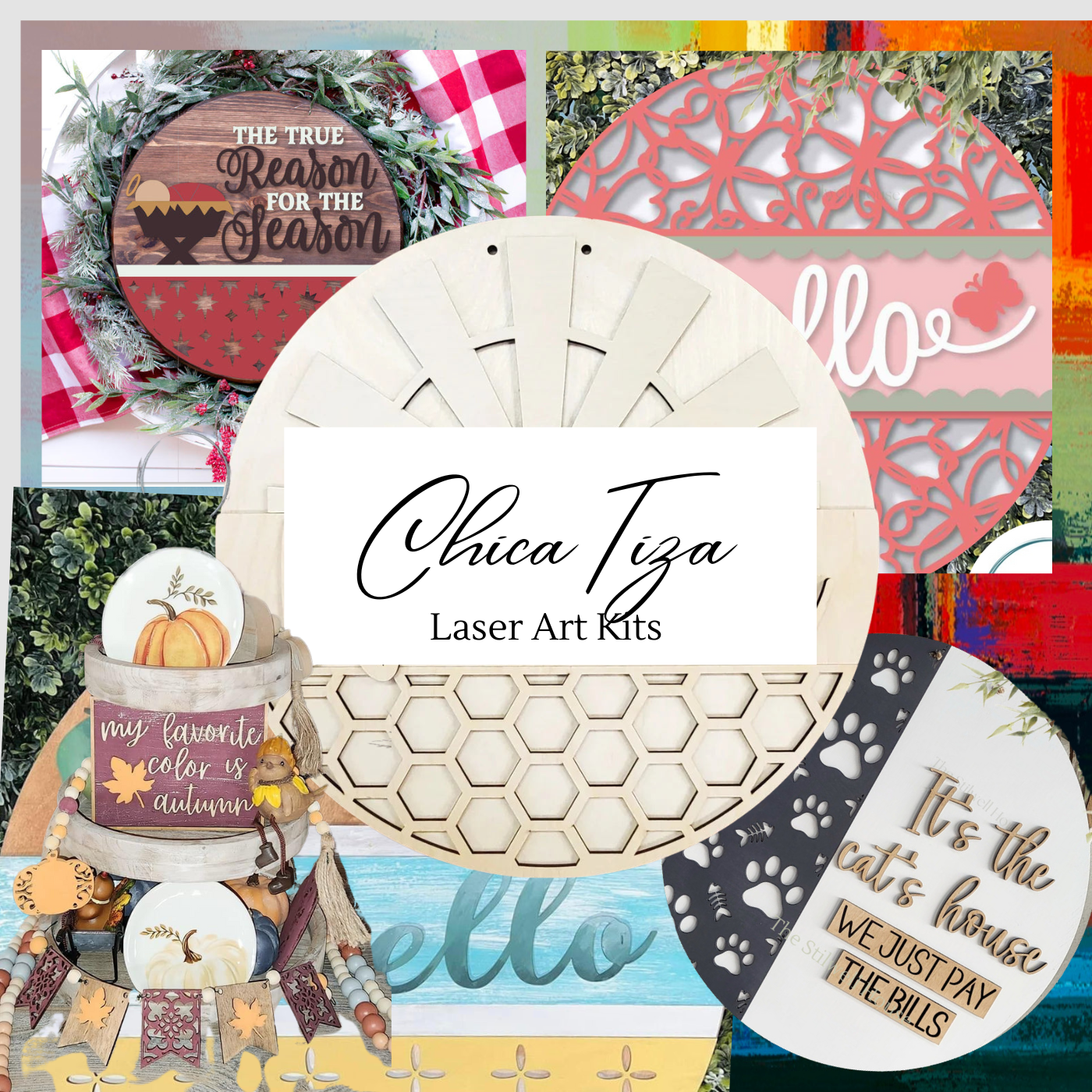
ChicaTiza